Research, user interviews, synthesizing user data, ideation, paper and digital wireframing, low and high-fidelity prototyping, conducting usability studies, accounting for accessibility, and iterating on designs.
Figma, Krita, Google Workspace
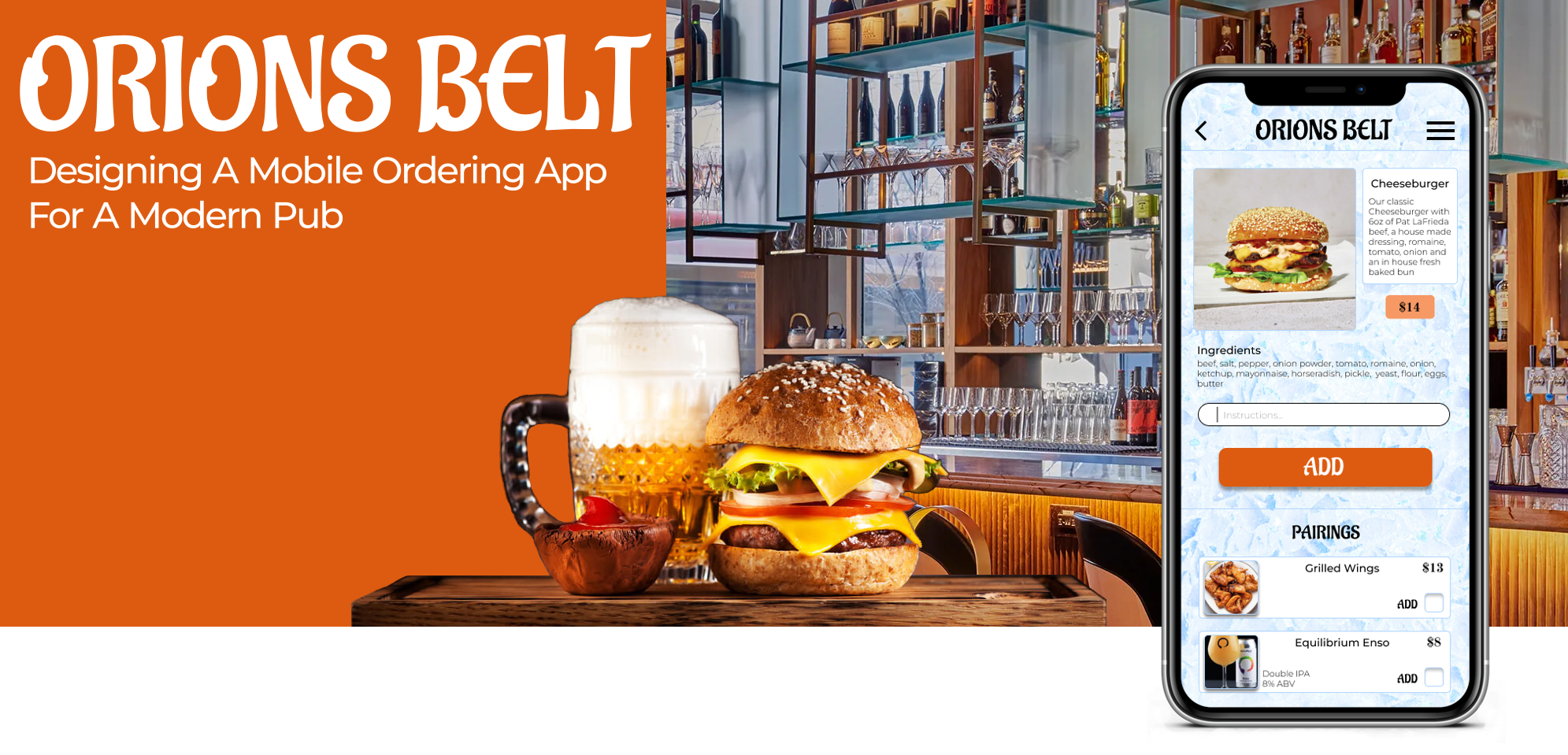
Orions Belt is a modern pub that wants to move away from traditional wait service and see if a mobile ordering app will help streamline the dining process, increase customer satisfaction and increase profits. They want a customer to be able to scan a QR code to access the pubs ordering menu, place their order and pay. It is my challenge to discover what pain points a user might experience during this process and design an ordering app that addresses all users needs.
Customers want an easy, stress free ordering process and could have questions about menu items. A mobile ordering app might be novel and difficult for customers to use, and might lack the information needed for some users to complete an order.
Create an inhouse mobile ordering app that is easy to use, intuitive, and accommodates all types of users by providing them the information necessary to complete an order.
I designed the Orions Belt mobile ordering app to have item images with screen reader capability, descriptions of each item, core ingredients listed for each item, a special request section and pairing suggestions that can be easily viewed and added.

Some customers have food allergies and dietary restrictions, and wonder if they would be able to order from a menu app.
Some users can find apps to be difficult to navigate or intimidating. The mobile ordering app should be clear in action, easy to use and intuitive.
An app might not give a proper description or make recommendations like a traditional waiter would, leaving the user with questions.
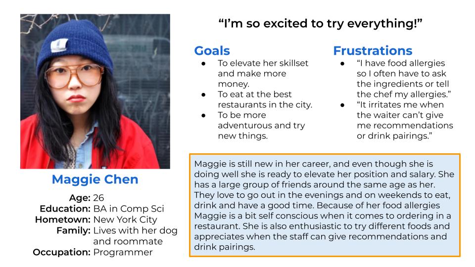
Synthesizing the information I gained from user research, empathy maps and user pain points I created Primary and Secondary Personas.
Maggie is a young professional with food allergies who wants to be informed of ingredients of menu items so she can decide what to order without having to ask a lot of questions.
Bradley is a busy executive that goes out after work often to entertain clients, family or friends, who wants to order from an easy to read and navigate menu so he doesn't get frustrated with the experience and can enjoy his time with his company.
.jpg)
Maggie is a young professional that dines out often who needs to know what ingredients are used in the restaurants menu options because she has food allergies. Her user journey map reveals that a mobile ordering app with item images, descriptions and ingredients listed could enhance her dining experience while also decreasing wait time.
I found it difficult to do a proper competitive audit in that most restaurants with apps are either for take out or are fast food restaurants. Having a QR code initiated app that allows for in house ordering to a table is still relatively novel. I have experienced this type of app before and found them to be very stripped down, lacking any visual design, with awkward functionality, lack of images and a lack of detailed descriptions.
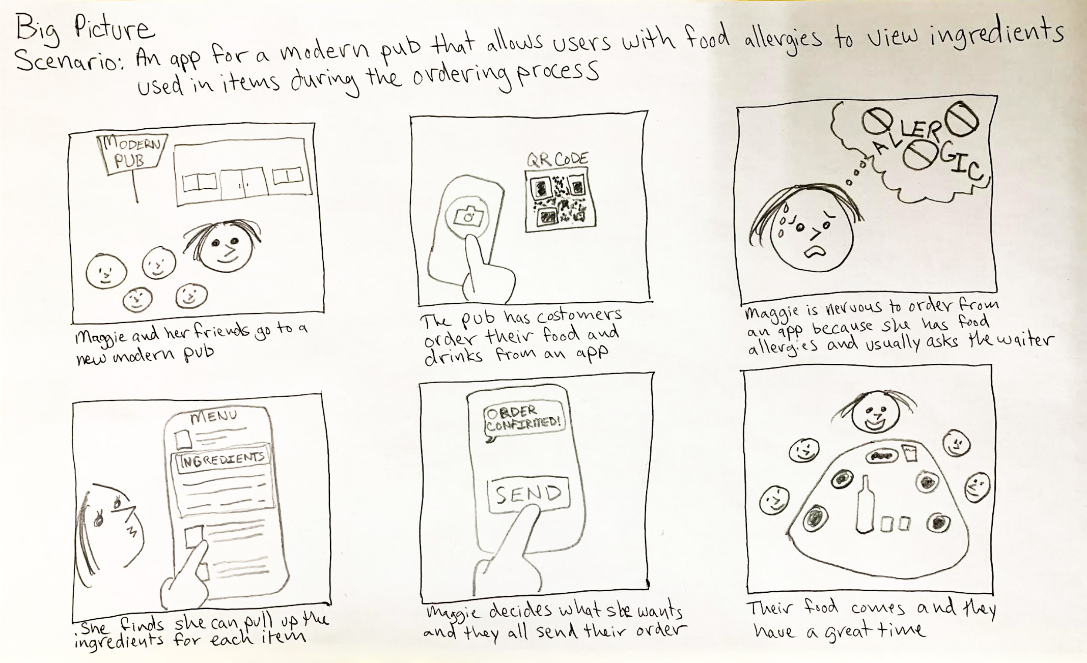
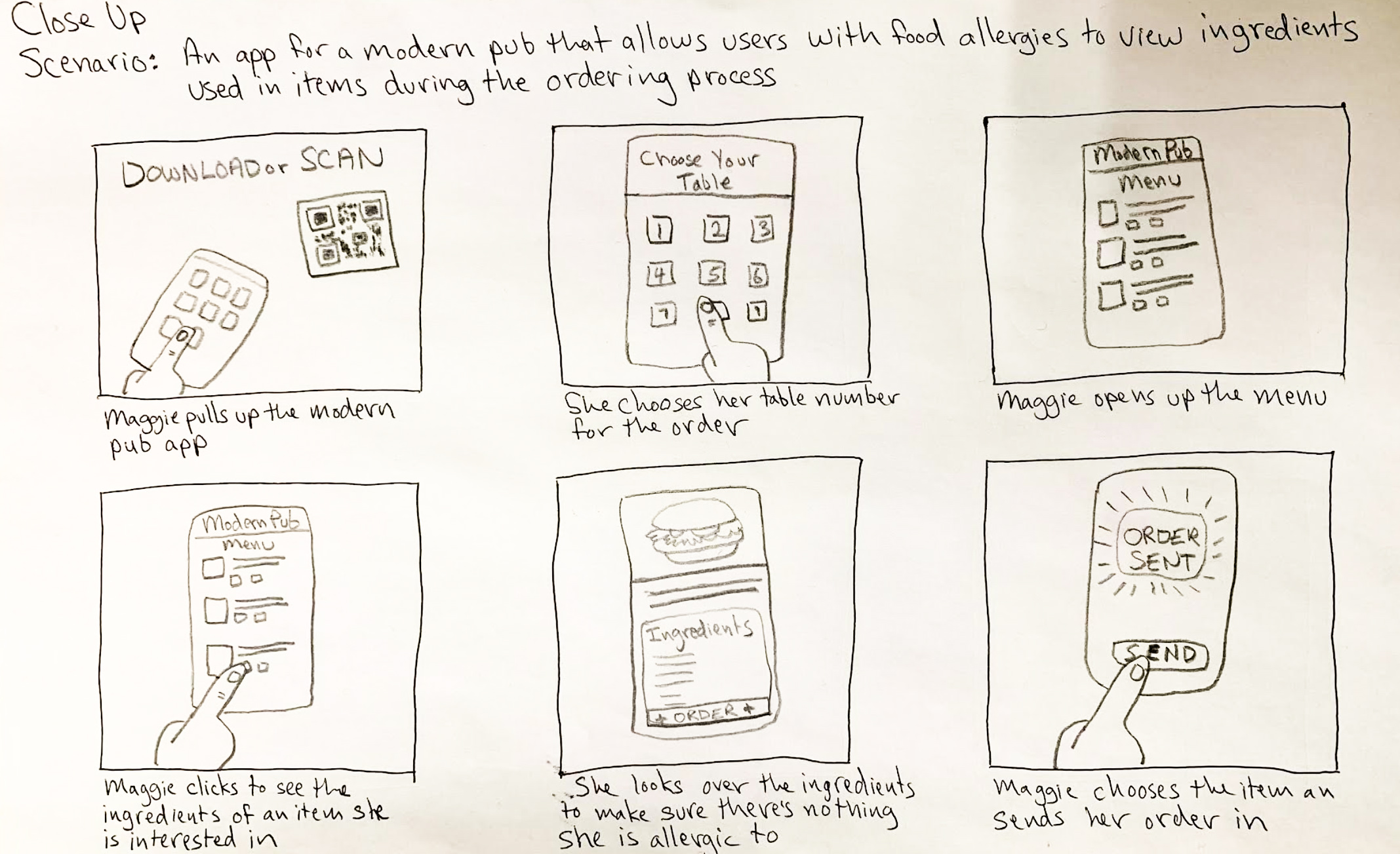
Using my research as a foundation I started brainstorming ways to meet the users needs through my design. After some creative exercises I drew up a big picture and a close up storyboard for Maggie Chen, my Primary Persona. This lead me to figuring out the basic user flow for ordering and to my intilal paper wireframe designs.
The initial user flow to begin paper wireframing was to open the app, select dine in, select food menu, select item, add item and place order. I eventually cut out the second screen from the user flow and added buttons to the top of the menu screen allowing the user to shift between food, drink and specials menus.
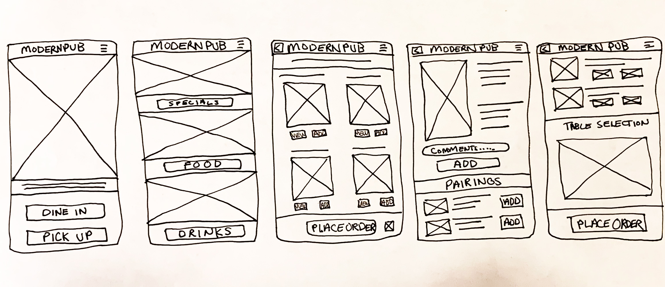
In the next phase of designing wireframes I made sure to directly address user problems and concerns that I gathered earlier from user research.

Clear and intuitive design allowing for easy navigation was a key user need.
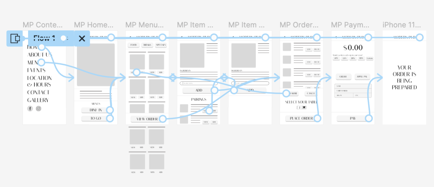
The low-fidelity prototype connected the user flow of navigating from the homescreen to the menu, selecting and item, adding a paring with the item, viewing the order and proceeding to checkout.
-Users need to be able to add an item and a pairing suggestion together easily.
-The menu link on the home page needs to be more clear to users.
-Users need to be able to select the quantity of the item they want to add to their order.
-Adding a pairing is still confusing to some users.
-Users need the quantity selection and table selection to be more refined.
-The menu page needs to be more streamline and have less buttons.
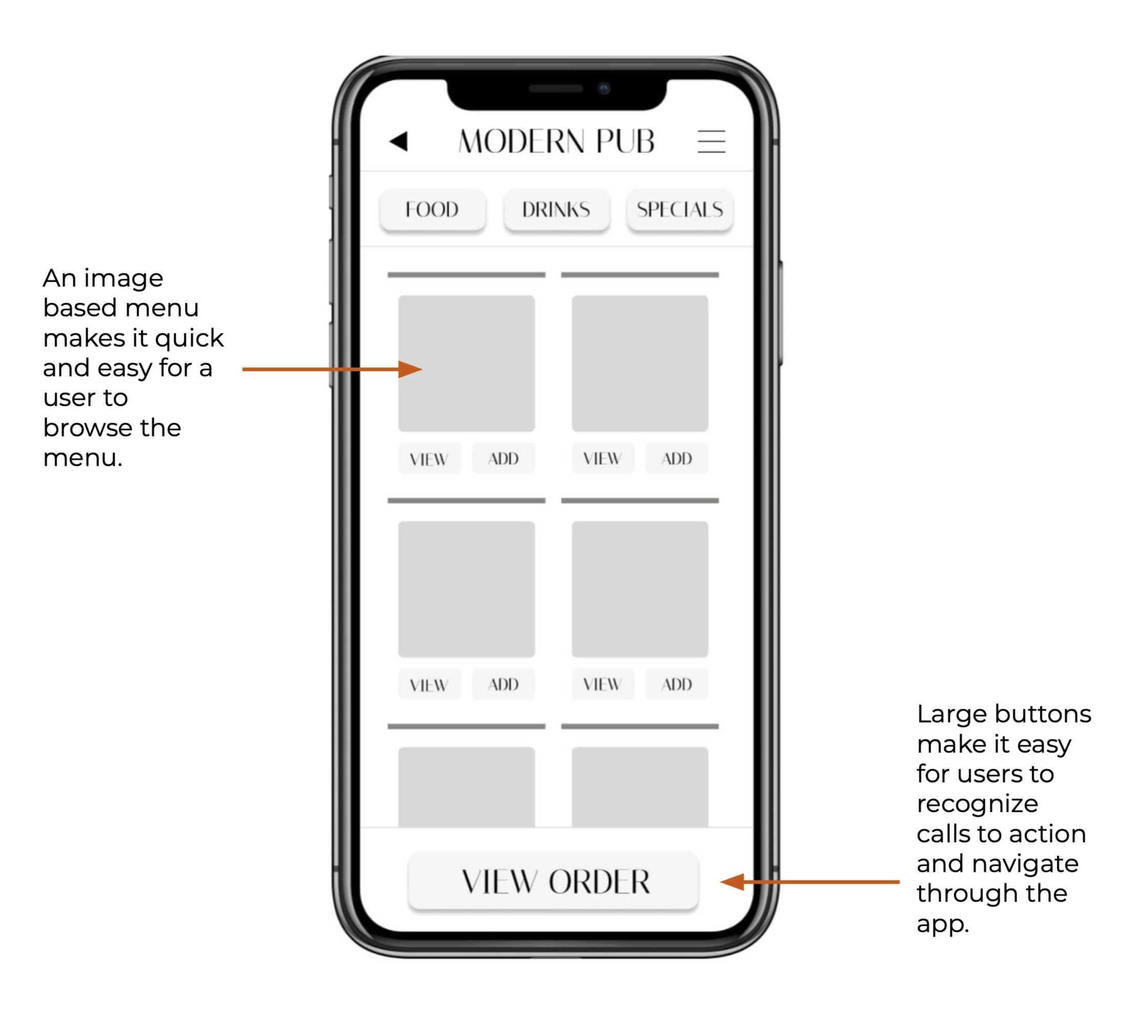
Based on feedback from the second usability study I simplified the menu with actionable image buttons that lead the user to the selected items page, and replaced the original buttons with a price point place holder. The call to action buttons are highly contrasted for emphasis and accessibility.


To make viewing and adding a pairing for users simpler I designed an actionable image button that opens a popup description of the pairing suggestion with a clear X icon to close, and a checkbox if the user would like to add the pairing to their order.
Based on user feedback I added a quantity selection for each item and then made the quantity and delete buttons more accessible by adding recognizable icons. I refined the table selection by adding an interactive pop up.


The final high-fidelity prototype presents the user with an ordering experience. The user flow order starts with the home screen>menu>caesar salad>view & add wing pairing>view & add beer pairing>add comments>add to order>quantity of beer>select table>place order>add tip>credit>pay>confirmation screen.

Orions Belt mobile ordering app was well received in both usability studies. Users in general loved the look of it and felt it was very easy to navigate. In response to our primary personas problem statement all users felt it would be easy to make ordering decisions if they had a food allergy or dietary restriction.
While solely working on all aspects of UX design for the creation of this app I learned to truly appreciate the value of building something based on the needs and feedback of the people that will be using it. Using the UX design cycle in the end will result in an evolved and superior product.