
My task was to design a responsive website for a pet adoption center that addressed potential user needs for online browsing and adoption process. I followed the five step process of empathizing, defining, ideating, prototyping and testing, as well as conceptualizing and branding a pet adoption center.
The challenge was to identify user pain points form past experience, and based on that create a pet adoption center website that is responsive to smartphone browsing, has intuitive function, an easy to follow adoption process, and that clearly provides all of the necessary information for a user to complete most of that process online. The goal was to design an experience similar to online consumer shopping while still giving the adoption center control with an application screening process.
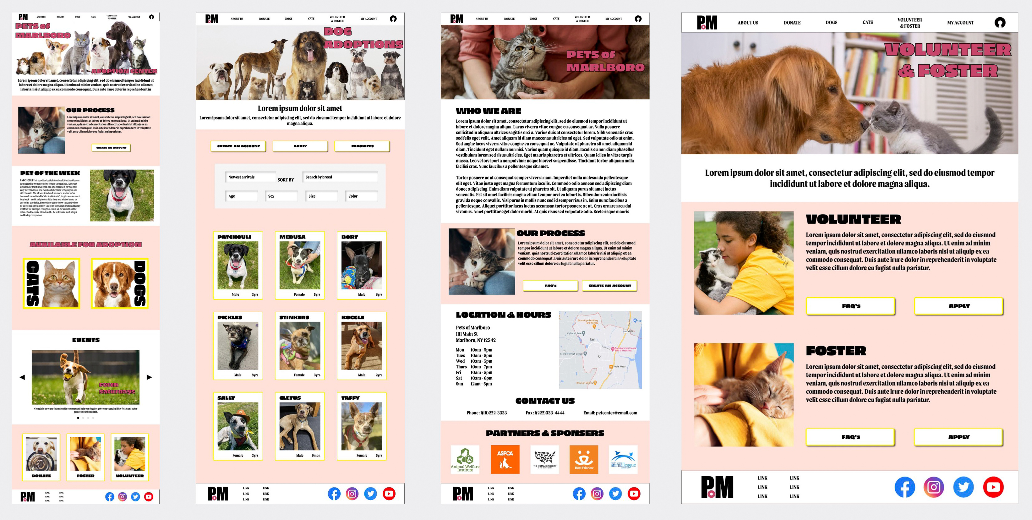
I designed a responsive website that is process forward, with immediate clarity on how to adopt a pet through this adoption center. It is easy to browse, informative and with minimal effort a user can create an account to receive benefits such as saving their favorite potential pets, filling out an online application for pre approval (allowing for less wait time), and scheduling appointments online to visit potential adoptions.
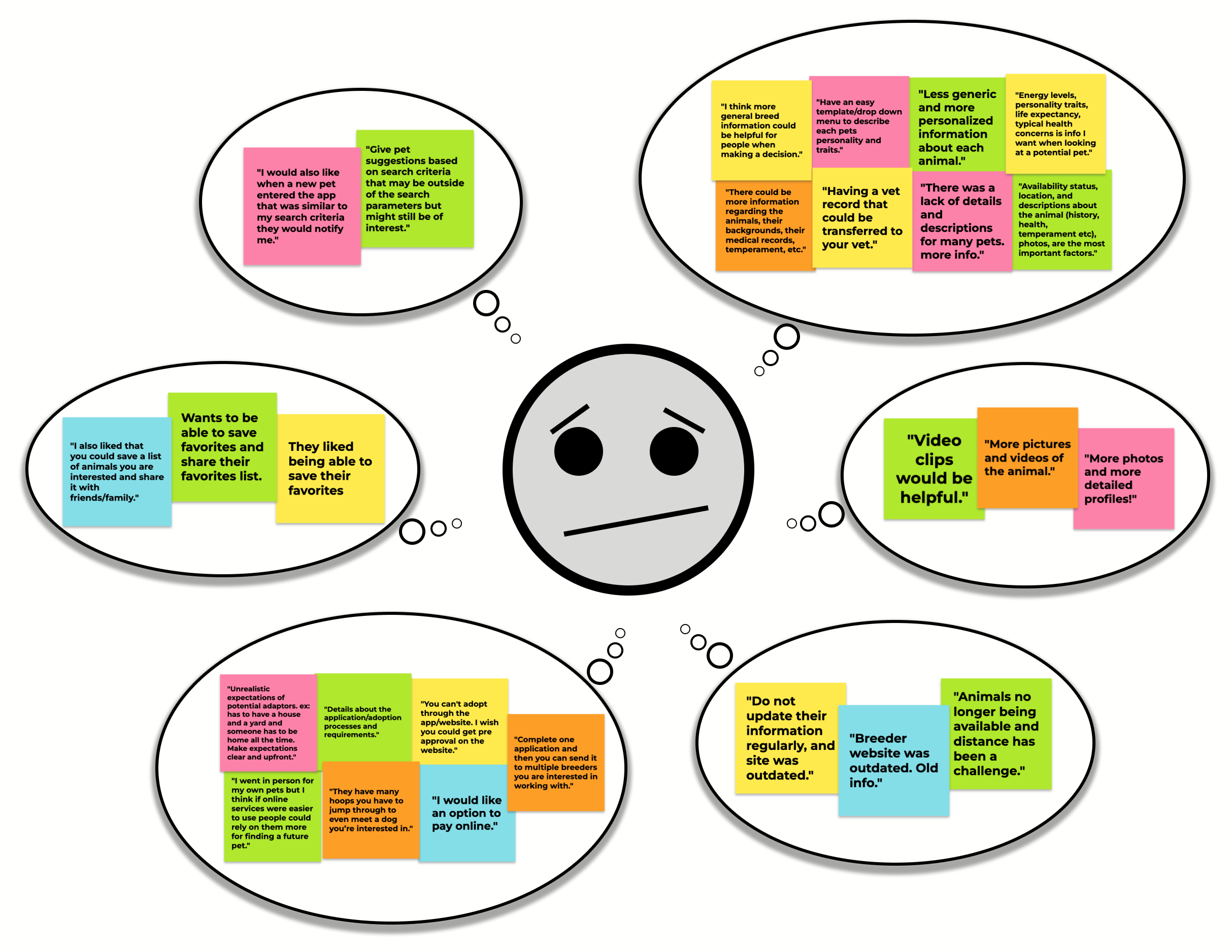
I choose to use an online questionnaire based on financial and time constraints to acquire user feedback. The six questionnaire participants ranged in ages between 23 and 62, and were diverse in gender, background and economic status. I then summarized their responses and created empathy maps and an affinity diagram based on what information I was able to obtain to understand these users, their pain points and their needs.
Most users encountered pet adoption websites and available pet profiles that had outdated information. Users also found that some pets they were interested in adopting on the website were actually no longer available.
Users found that many pet profiles only have one image or sometimes none at all. Users want multiple images and videos if possible. They also found pet profiles often had generic descriptions that lacked behavioral traits, backgrounds and health information.
Some users felt they weren't able to accomplish much in the adoption process through websites and apps other than looking through pet profiles. Users want to be able to fill out one time applications for adoption approval and be able to make visitation appointments using an animal centers website or app.
Many users felt that on websites and apps the process and criteria for adopting a pet was not clear or upfront. Some users also felt the criteria for adopting a pet were unrealistic for the average person.
Synthesizing the data I obtained from my user research I created a primary and secondary persona, developed their problem statements and predicted what their user user journey would be like.
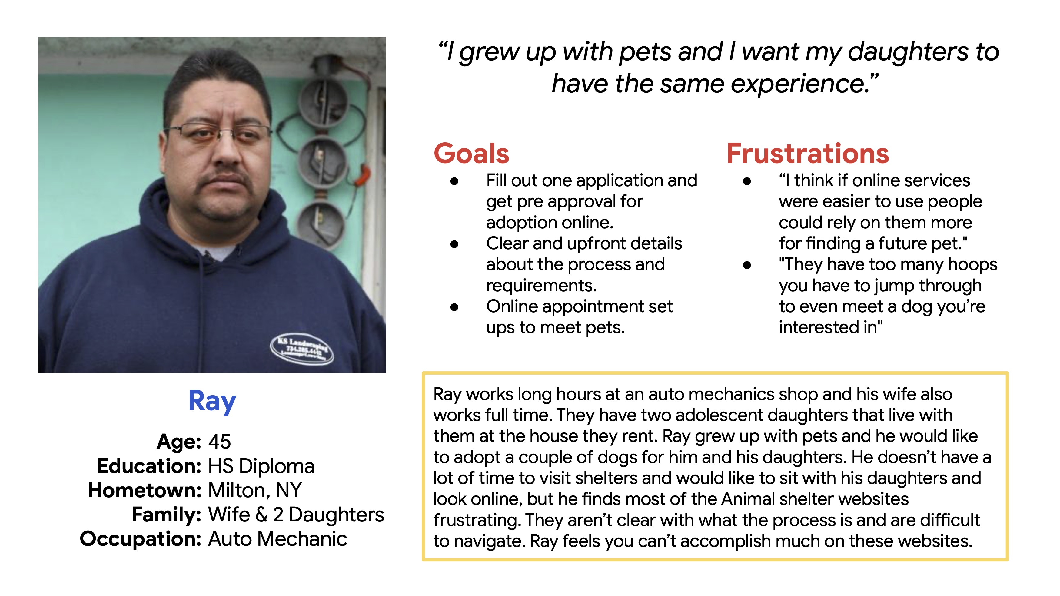
Ray Valenzula is a father who works long hours, and who needs to use an animal shelters website for most of the pet adoption process because he doesn’t have much time, but wants to go through the search and adoption process with his family all together.
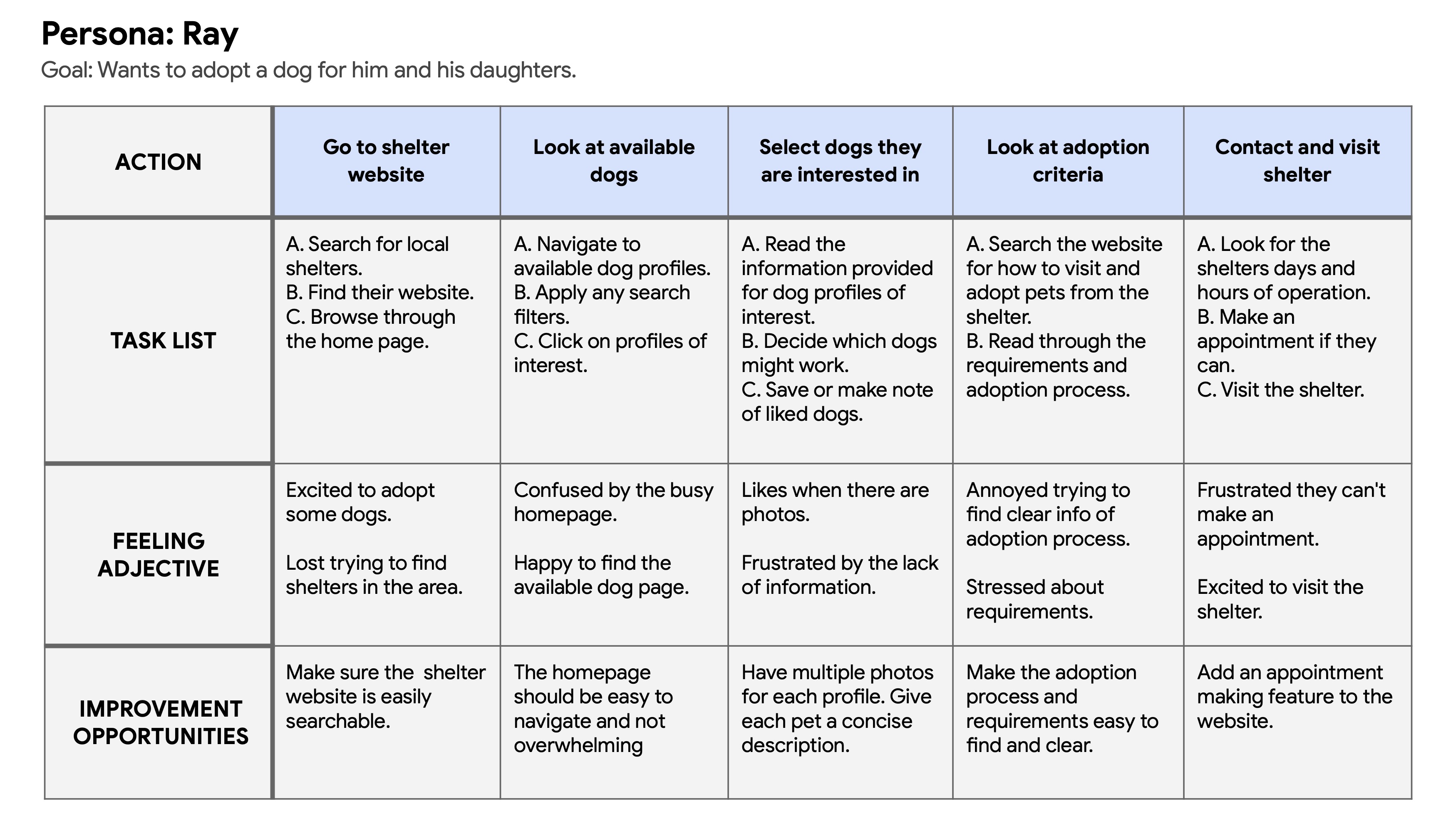
Rays user journey reveals that an updated and informative website that is easy to navigate, with clear adoption process requirements, an online pre approved application and an appointment setting feature would enhance his user experience.

Portia is a home owner and remote worker who needs the animal adoption centers website to be informative and up to date because she wants to browse and select the right pets to foster and adopt.
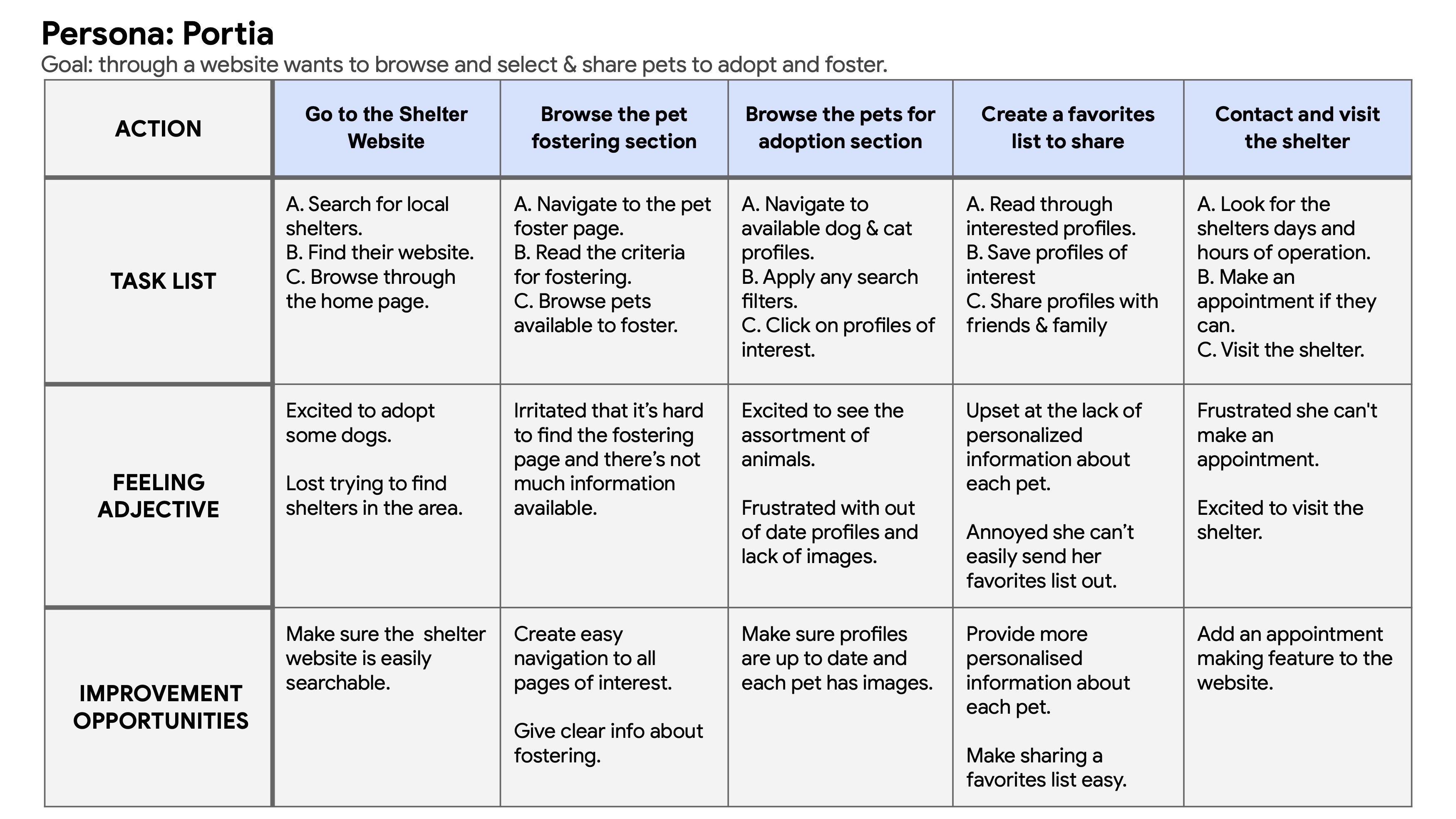
Portia's user journey reveals that an updated and easily navigated website with images and detailed pet descriptions would enhance her user experience. She would also benefit from a favorite pets feature so she can save and share her favorite pet options.
I started my ideation with some "How might we?" and "Crazy 8's" exercises, keeping in mind my user research, user pain points, user journeys and problem statement. The general idea that stood out was how to make the adoption website easy, quick, fulfilling and exciting. One that gives the user a similar feeling as going to their favorite online shopping site and making that long desired purchase. Pets are not objects! But that doesn't mean adopting one has to be difficult.
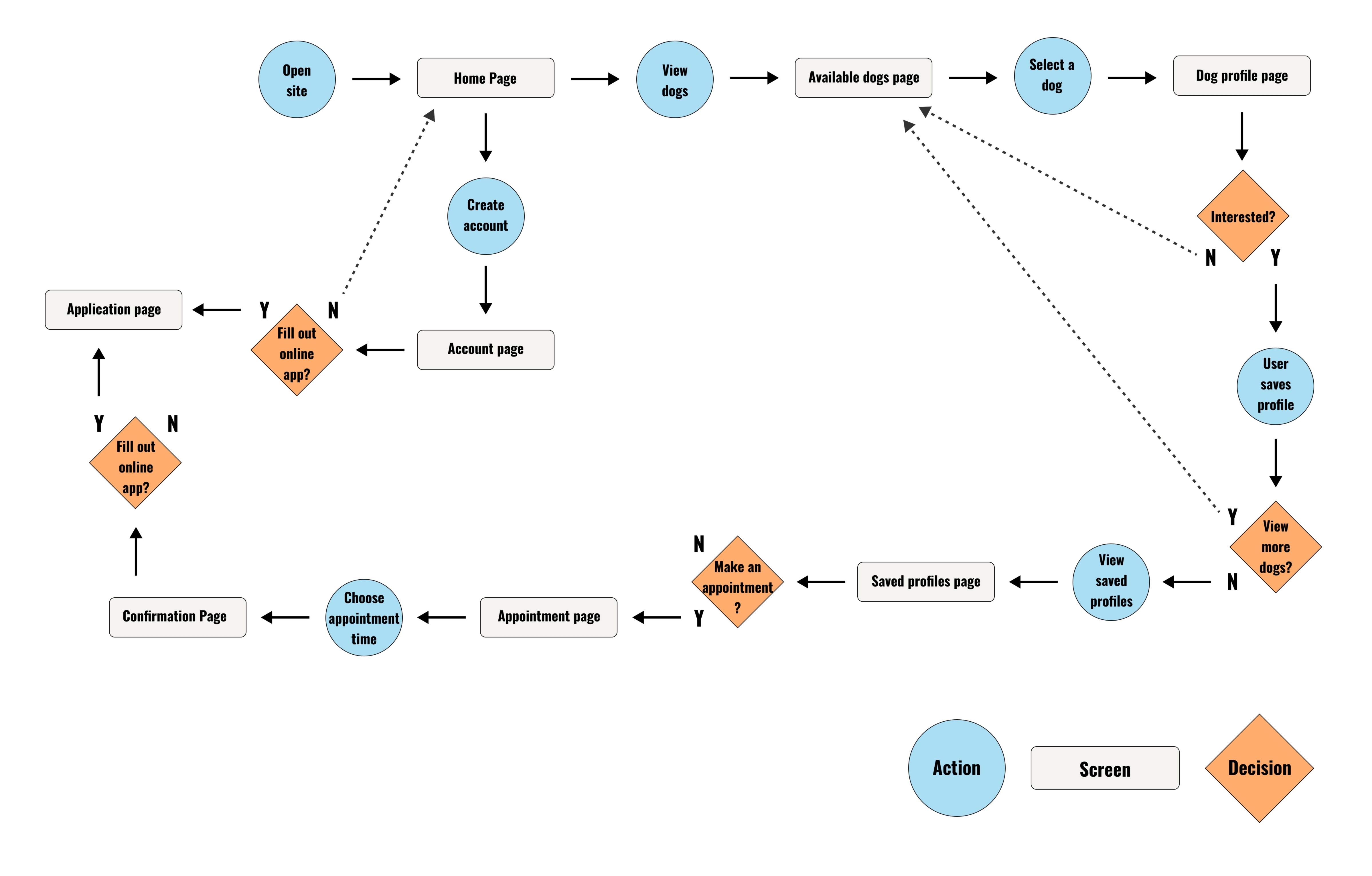
I created a user flow for my persona Ray to show what it could be like adopting a dog using the website i'm designing. There are multiple routes leading the user to fill out an online adoption application, which would ultimately make the adoption process more streamline, but the user should not have to fill out the application to be able to browse and save profiles, or make an appointment.
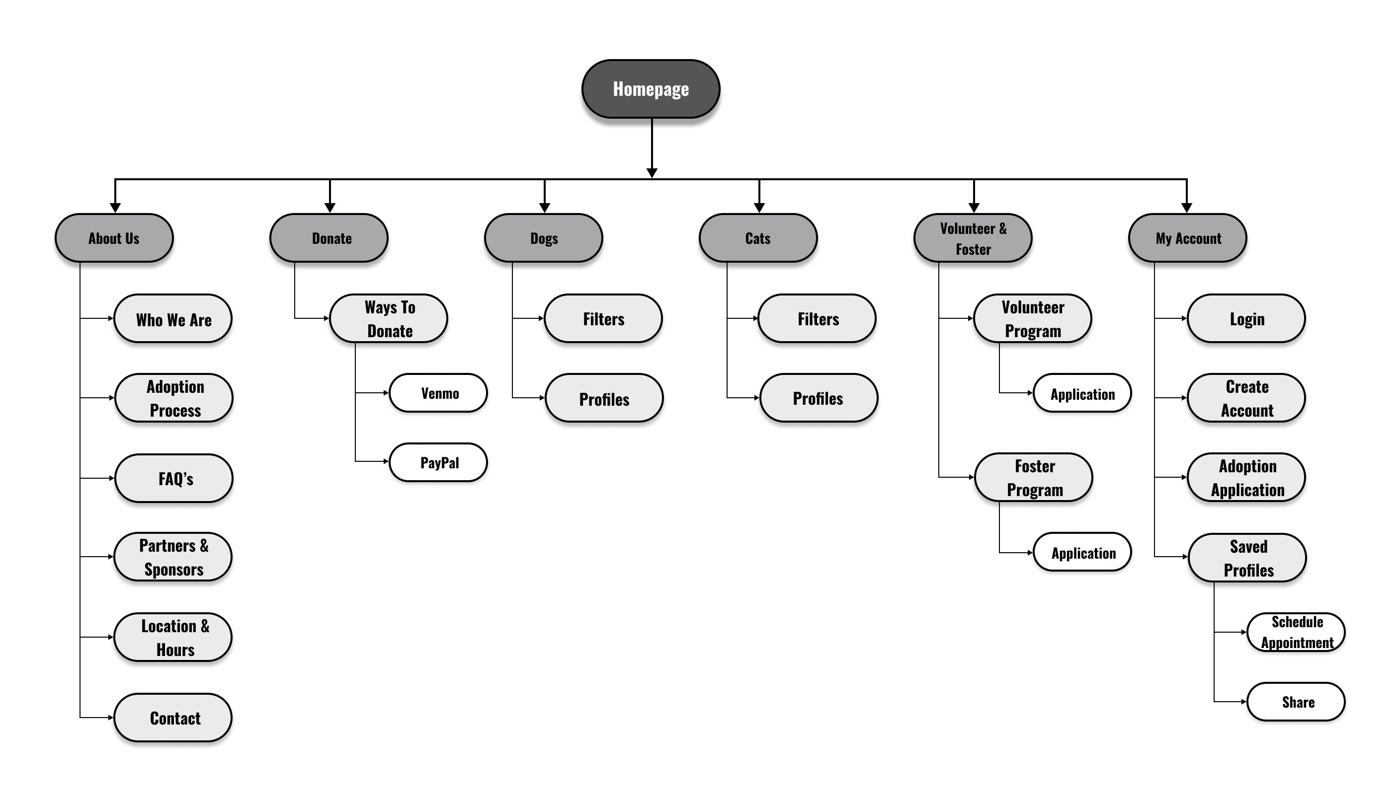
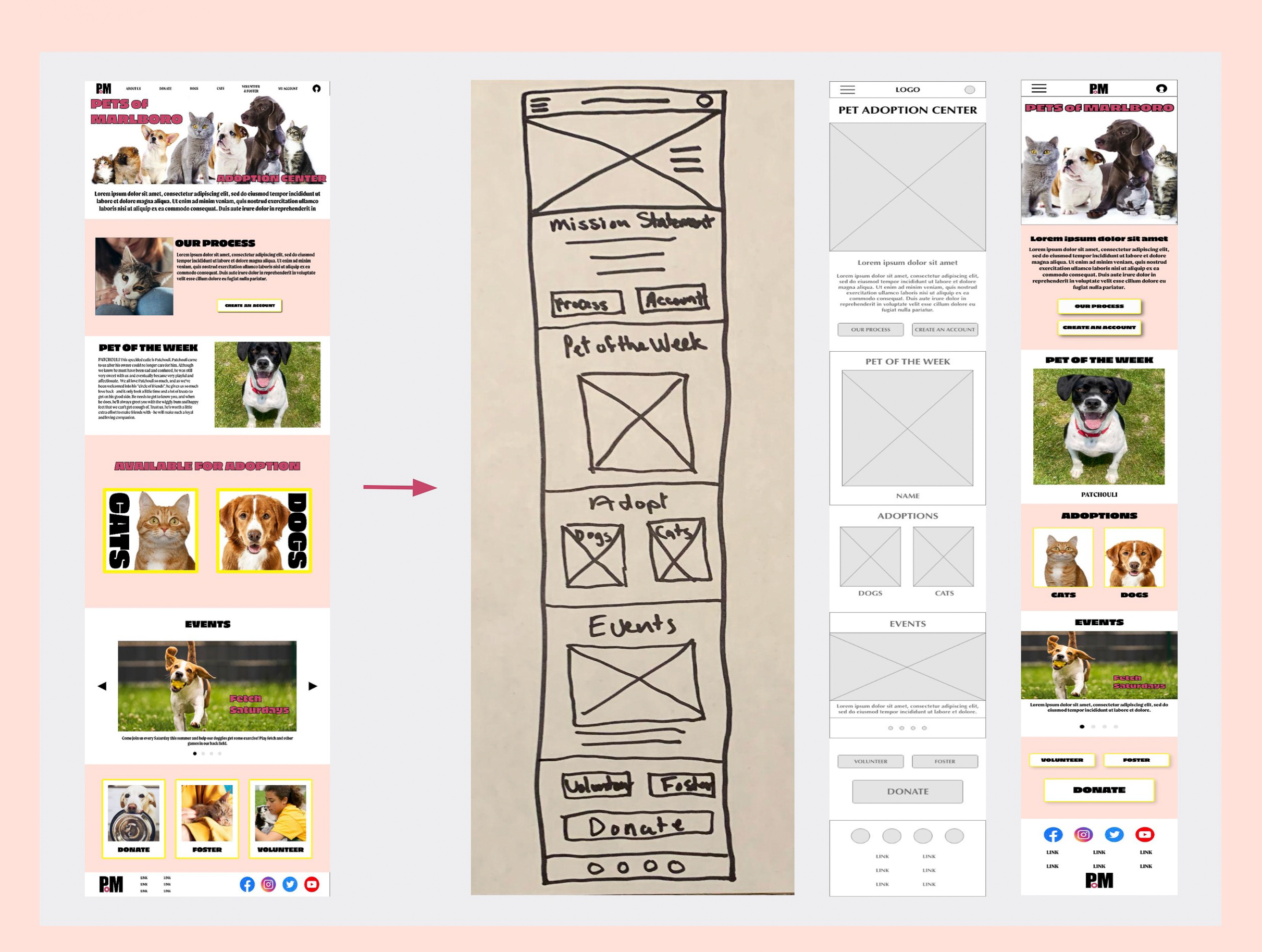
Cumulating together the understanding i've gained researching my users experience and needs, defining what their problems are and ideating creative solutions to address those problems I've created a site map that will guide me into the next steps of wireframing and prototyping. This site map addresses the users needs through ease of navigation, and providing the most function you can get from a pet adoption website before the user takes the final steps of heading to the adoption center to meet their pets of interest. By the end of the user journey through this site the user will understand what the adoption process is and what is needed from them, have filled out the online adoption application for pre approval, have viewed comprehensive pet profiles the lead them to selecting their favorites, have shared their favorite profiles with friends and family and will have made appointments to visit their potential future pets.
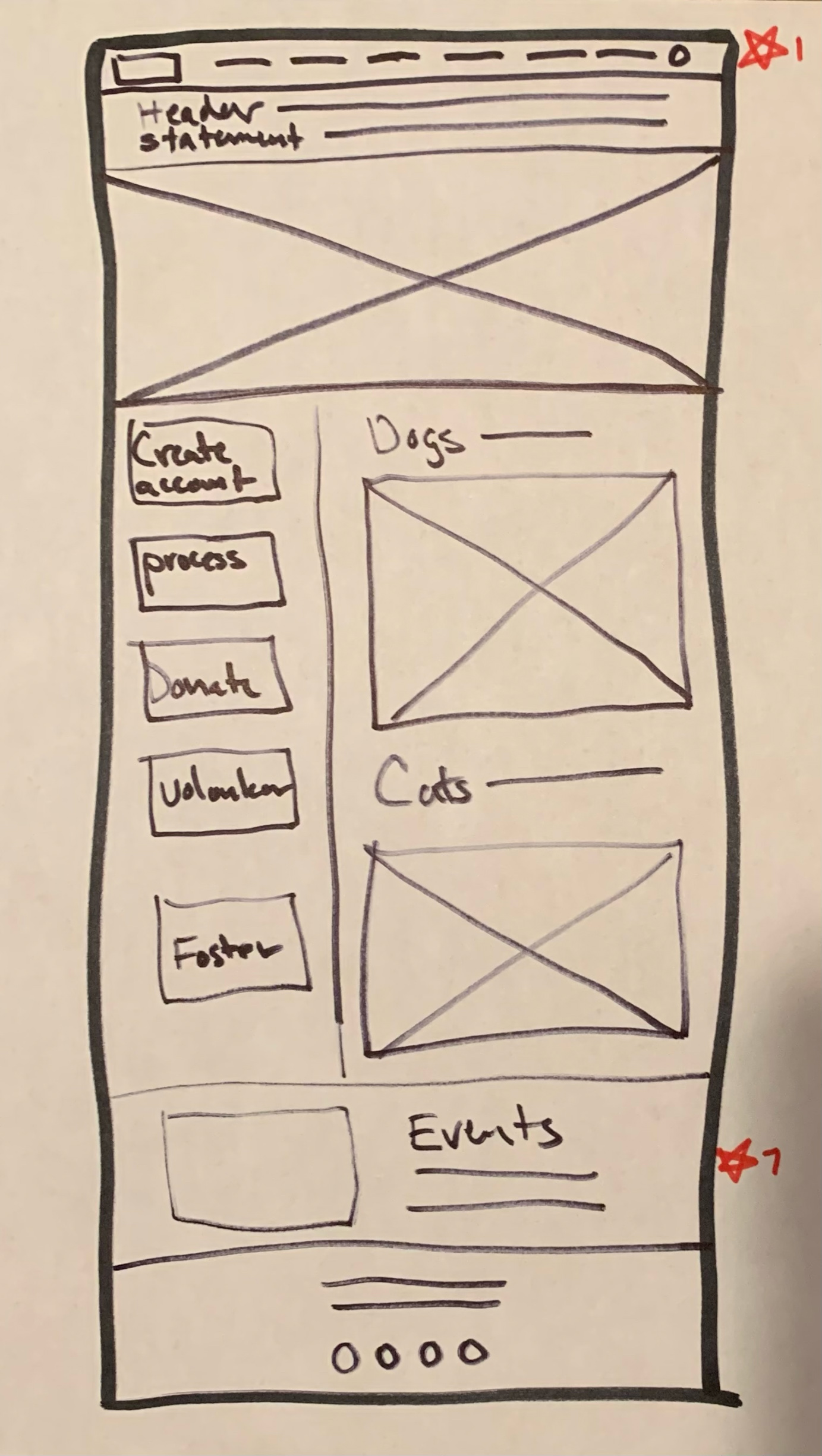
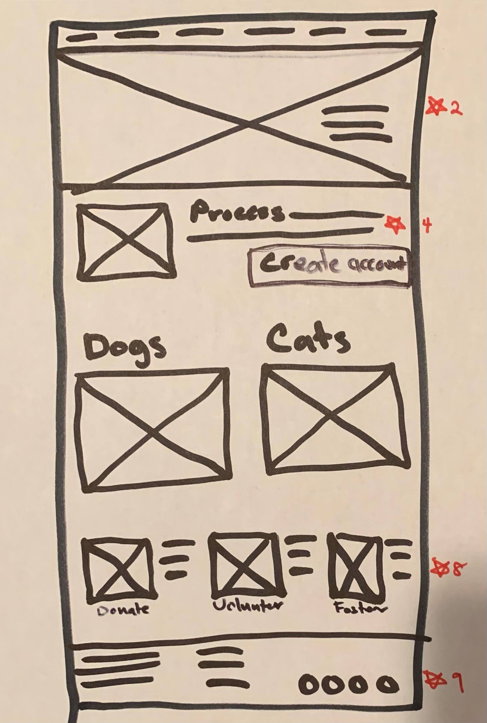
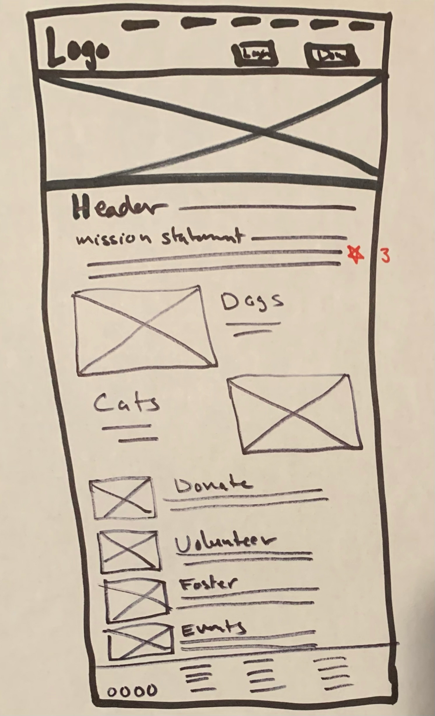
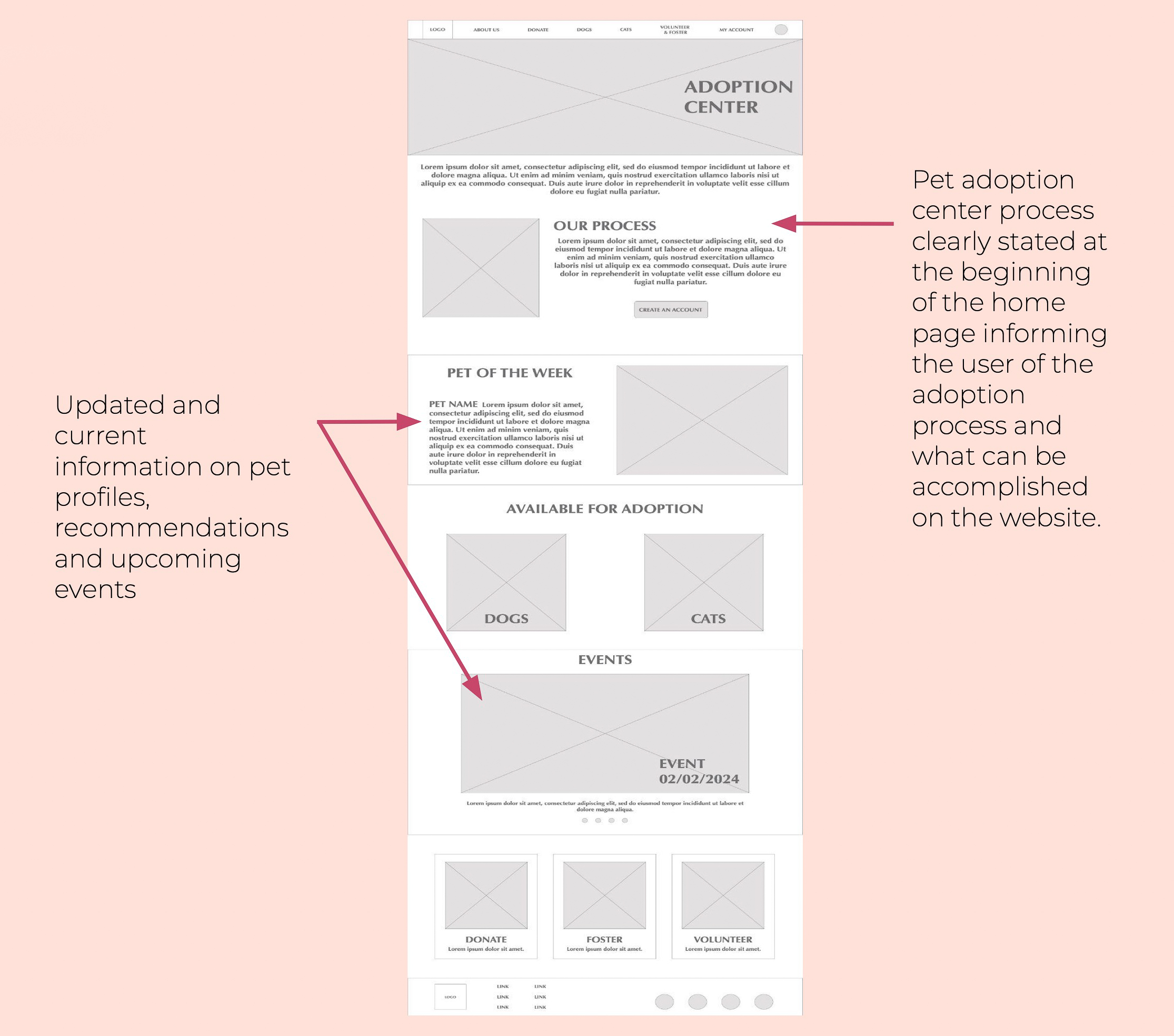
After Iterating many paper wireframes I took the most successful features from my top four sketches to create a desktop homepage for the pet adoption center. The wireframe homepage has a balance of images, information and direction for users to easily navigate through. Addressing user pain points the centers adoption process is positioned in the first section of the homepage to create initial clarity.
%20copy.jpg)
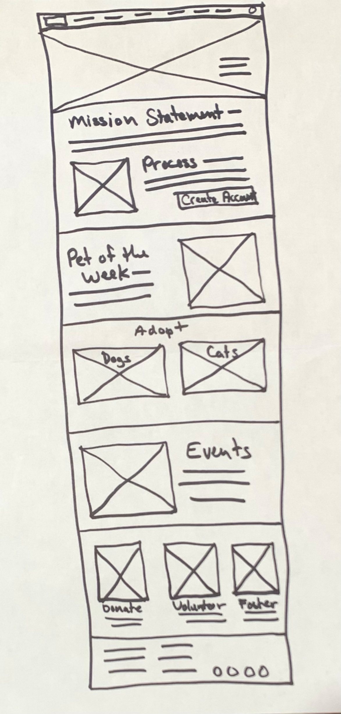
In the next phase of designing wireframes the goal was to create an image forward and easy to navigate website that addressed user pain points such as lack of up to date information and a clear and informative adoption process.
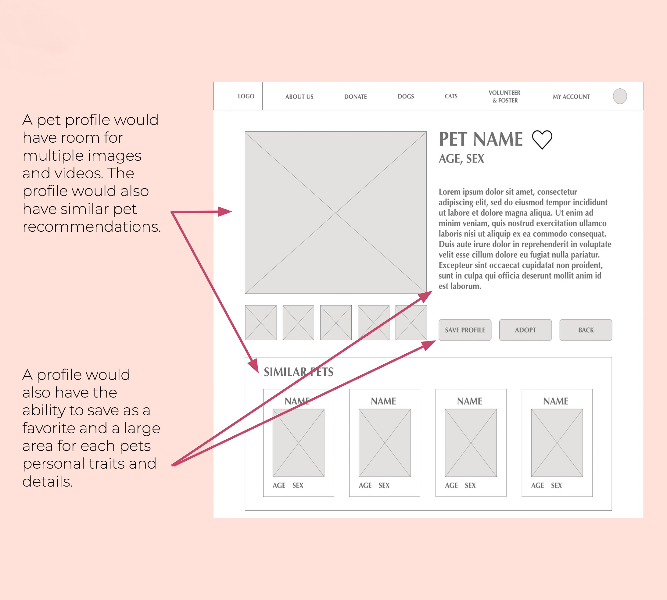
In designing the pet profile wireframe the goal was to address such user pain points as lack of personal details of each pet, lack of images and videos, saving favorite profiles and being offered other pet recommendations based on what pet they’ve selected.
The user flow starts on the home page, create an account, view dogs, view Bort’s profile, save as favorite, back to dog profiles and view favorites, select the first favorite and make an appointment by selecting a day and time slot, appointment confirmation and fill out an application.

Using a low-fidelity prototype of the pet adoption center website I conducted a moderated usability study with five diverse participants to identify insights which guided me from wireframes to mockups.
-Based on the theme that: it is not clear how to navigate back to the adoption page from a profile, an insight is: make the profile a pop up window with a clear button to close it. (P0)
-Based on the theme that: to some users it is not clear when a profile has been favorited, an insight is: design the favorite icon to stand out more. (P1)
-Based on the theme that: for some users selecting which of their favorite pets to make an appointment for is not clear, an insight is: when making an appointment make selected pets in the favorites section stand out more visually and add verbiage. (P1)
Based on user feedback the Pet Profile page was redesigned to be a pop up with a dark but transparent border.There is a clear large “X” indicating to the user how to close the pop up window. The saving favorites feature in the pop up window has also been re designed, both in the icon and in the save button, to emphasize that a pet has been saved to the users favorite list.

Based on the insight that when making an appointment to visit your favorite pets, the pets the user has selected needs to stand out more: the selected pets have been redesigned to emphasize selection with a darker border and a heavy shadow around the selected pet, as well as the black check box below.

The goal was to take the look, feel and branding of the website and make it responsive to fit with a smartphone or small tablet, starting with a sketch wireframe, then digital wireframe and then a completed Mockup.
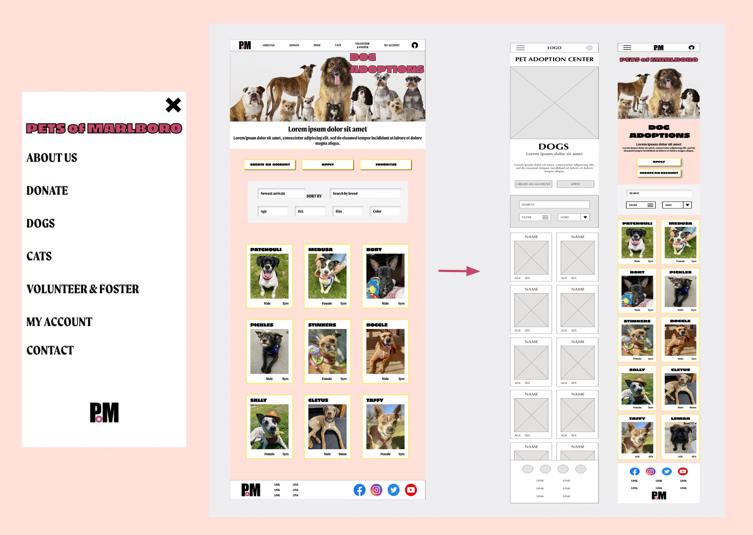
The Navigation bar was turned into a hamburger with a pop up menu. The Pet adoption dog page was condensed from three to two profiles per line and the search section was also condensed to a filter hamburger menu and a sort drop down selection menu.
The user flow starts on the home page, create an account, view dogs, view Bort’s profile, save as favorite, back to dog profiles and view favorites, select the first favorite and make an appointment by selecting a day and time slot, appointment confirmation and fill out an application.

-Used large buttons with a high contrast to stand out from the background and to emphasize calls to action.
-Used recognizable icons through out the app for instruction and navigation.
-Menu images assist for non english users. Written descriptions and buttons with text allow for screen reader availability for users who are visually impaired.
Some of the next steps I would take to continue with this project or hypothetically present it to a client would be:
-Add some realistic copy to my mockups. If I could not find any appropriate verbiage I would generate some using AI.
-I would build more responsive mockups and test prototypes for phone and tablet.
-Narrow down focus on features that met user needs like refining the favorite pet and appointment making features.
Thank you for taking the time to review my pet adoption center responsive website case study. Remember that there are many wonderful domestic animals out there looking for someone to love unconditionally. Adopt or donate today!